Ahhh. Wonderful Autumn Chase. What a joy and a beauty of a project she turned out to be!
Total team effort by the guys at Smith Christopher Construction and our real estate partners at 22one Realty Co. Once the property was found and secured- we stayed in constant communication throughout the process to make sure- as always- that the design makes sense in terms of “real estate value”. This project in particular had some big changes as the market started to shift mid-renovation! And we believe that’s the most valuable thing you can offer to any client: understanding both the HOME itself (what makes it aesthetically and structurally ‘work’)- as well as the market surrounding it.
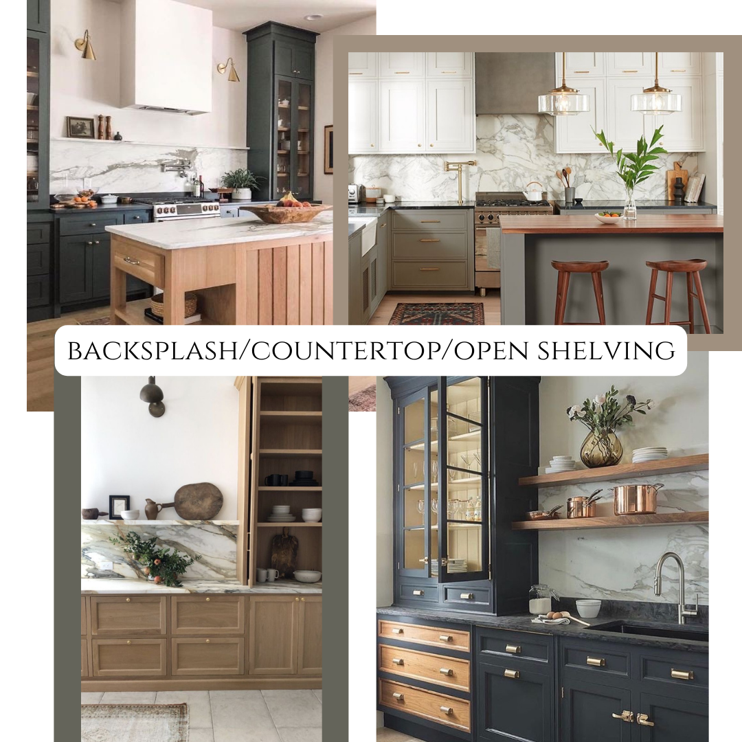
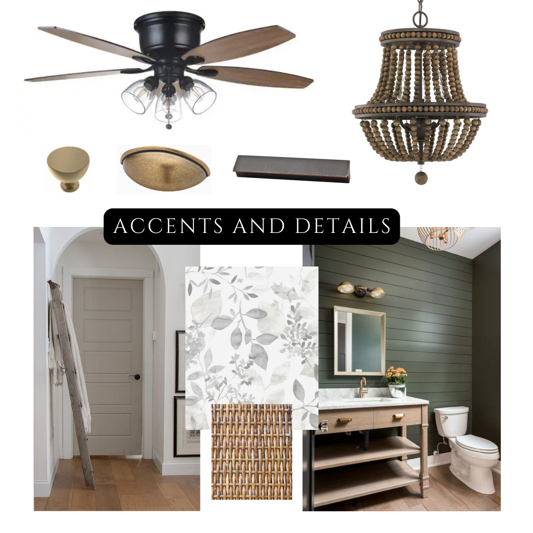
Once we presented our “mood board ideas” (shown in photos) to the partners- they were on board and we got started!
Our goal was to keep the integrity of the traditional style and character of the home, while bringing it into it’s most ‘modern’ form.
On the exterior- we knew the brick needed a “facelift”, but some of the tones were still very nice to work with! We kept portions of the original brick exposed and pulled a beautiful warm (barely gray) color to enhance all that detail.
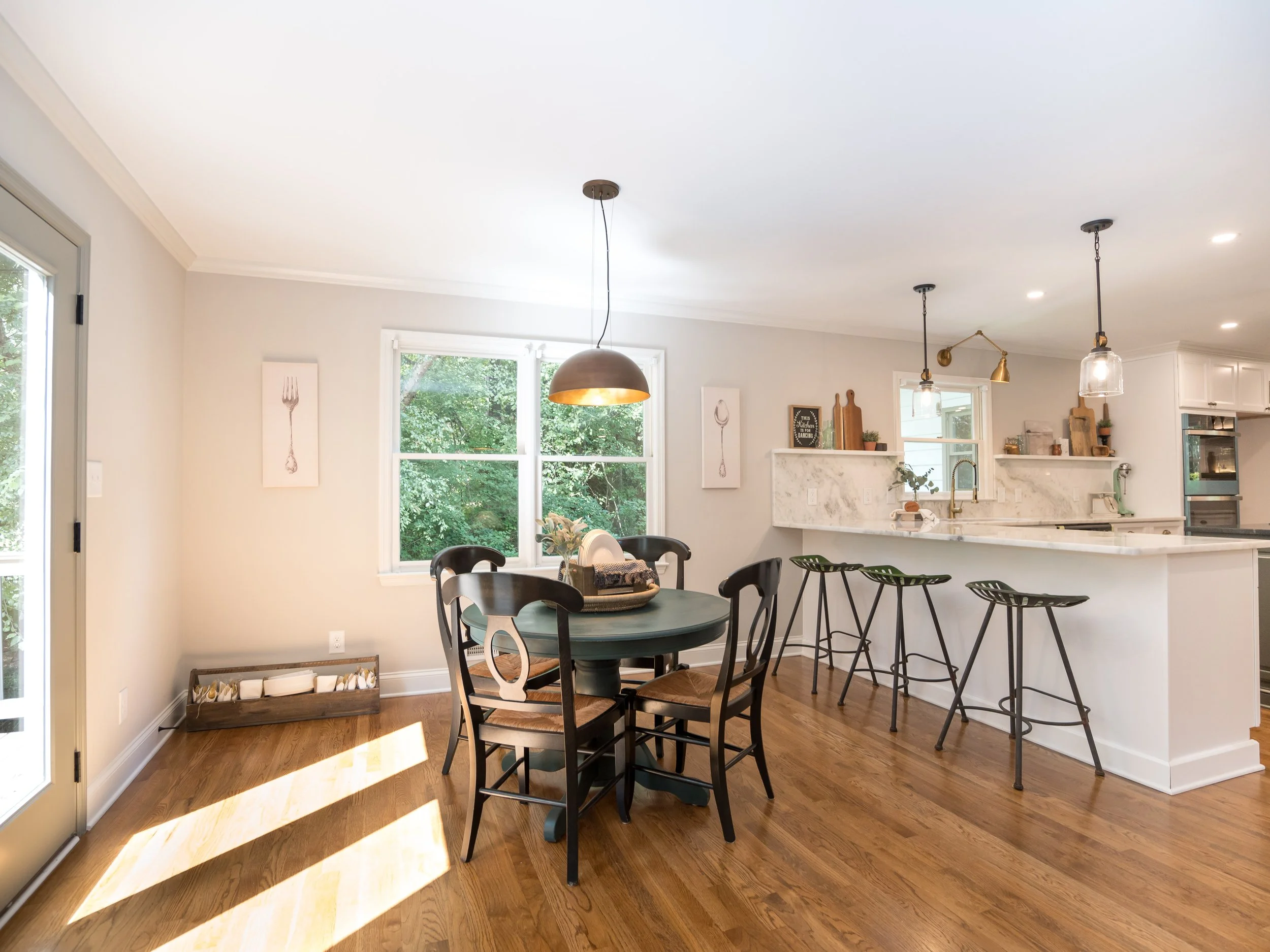
The first time we walked into the kitchen, we knew the countertops would be a show-stopper, so we started there! We found an incredible marble called “Shadow Storm” and paired it next to a honed, darker (almost black!) granite for the island. That way- the island felt more like a furniture piece than just another cabinet… which led us to designing the vent hood (one of our most favorite details- TYSM Smith Christopher!!).
We then took inspiration from all the original woodwork and used that in the new hardwood floors. And to “contrast” with all that warm, traditional wood- we added a stain with a little more “ash” to accent areas (kitchen shelving, custom vent hood trim, master bedroom barn door). Doing this gave us the ability to style with MANY different wood tones, which we knew would be great for the future homeowner.
The primary bathroom was completely transformed! We created a MASTERPIECE of a double-shower that is both stunning and cozy. The whole crew put so much effort into every single detail of this room. The same countertops from the kitchen island are featured on both vanities and the shower half-wall and threshold. The trio of main tile pulls all of our inspiration colors (gray/green, black, white) into one cohesive look, which makes this area feel “spa-like and special” while still tying into the rest of the house! *Fun fact- We used the same subway tile for the niche in here, the backsplash of the entire wet-bar in the kitchen, and the upstairs bathroom shower walls! Another small touch, just to ‘bring it all together’!
The living room had an amazing fireplace already and we didn’t want to mess with it- We simply enhanced what was around it! We highlighted what needed to be highlighted! We also took out a massive wall so that it opened up into the kitchen- total game changer.
The kitchen turned out to be one of the most “pretty” places in the entire home… the fact that it’s actually very functional (with hidden microwave compartments and TONS of storage, double ovens and open shelving with TWO sinks!) is just icing on the cake!
We partially finished in the basement so that there is now a rec/living room, bedroom, full bathroom, and room to expand! The bathroom vanity down here matches the kitchen island color (deep, deep greenish bronze) and is the same exact vanity as the one in the laundry room (yes- there’s a vanity and mirror in there too!). We truly believe the littlest details make the biggest differences and we stand by that!
The original owners came back to see the house right before we listed it and they were so complimentary of everything. They felt blown away that it was the same house. They also asked us to come help them at their other property! It was a very cool experience to show them around!
All in all- Autumn Chase was a dream, bucket-list, amazing project! We are so proud of everyone that worked on it… and we’re so happy for the new homeowners!
SPECIAL SHOUT OUTS (Feel free to contact them!):
Smith Christopher Construction
Enhanced Exposure Media- Brian Lowe
The Teena Regan Team- Real Estate
Interceramic USA (Tile)
COLORS USED:
Sherwin Williams-
Greek Villa (Exterior Brick/Trim, Interior Trim)
Cast Iron (Exterior Gutters, Interior Island and accent vanities)
Illusive Green (Exterior secondary entry doors, Interior doors/doorframes)
Moth Wing (Exterior Bay Windows and Window Grids + Garage Door)
Gossamer Veil (Interior Walls)
COUNTERTOPS:
Shadow Storm Marble
Honed Negresco Granite
TILE USED:
Interceramic-
Emma Gray Subway Tile
Dossier Barista
Madison Park Carrara
Wilshire Pewter (Cascade Mosaic)
WOOD STAINS:
Floors: MINWAX Special Walnut
Front Door: MINWAX Cooper Brown (on mahogany)
Accents in kitchen: MINWAX Habitat
Lighting/Hardware:
Progressive + Home Depot (Decorator’s Collection) + Hobby Lobby (decorative knobs)

Mood Board #1

Mood Board #2

Mood Board #3

KITCHEN: B + A

Living Room B + A

Master Bathroom B + A

Downstairs B + A

Downstairs B + A (2)

Kitchen/Breakfast B + A

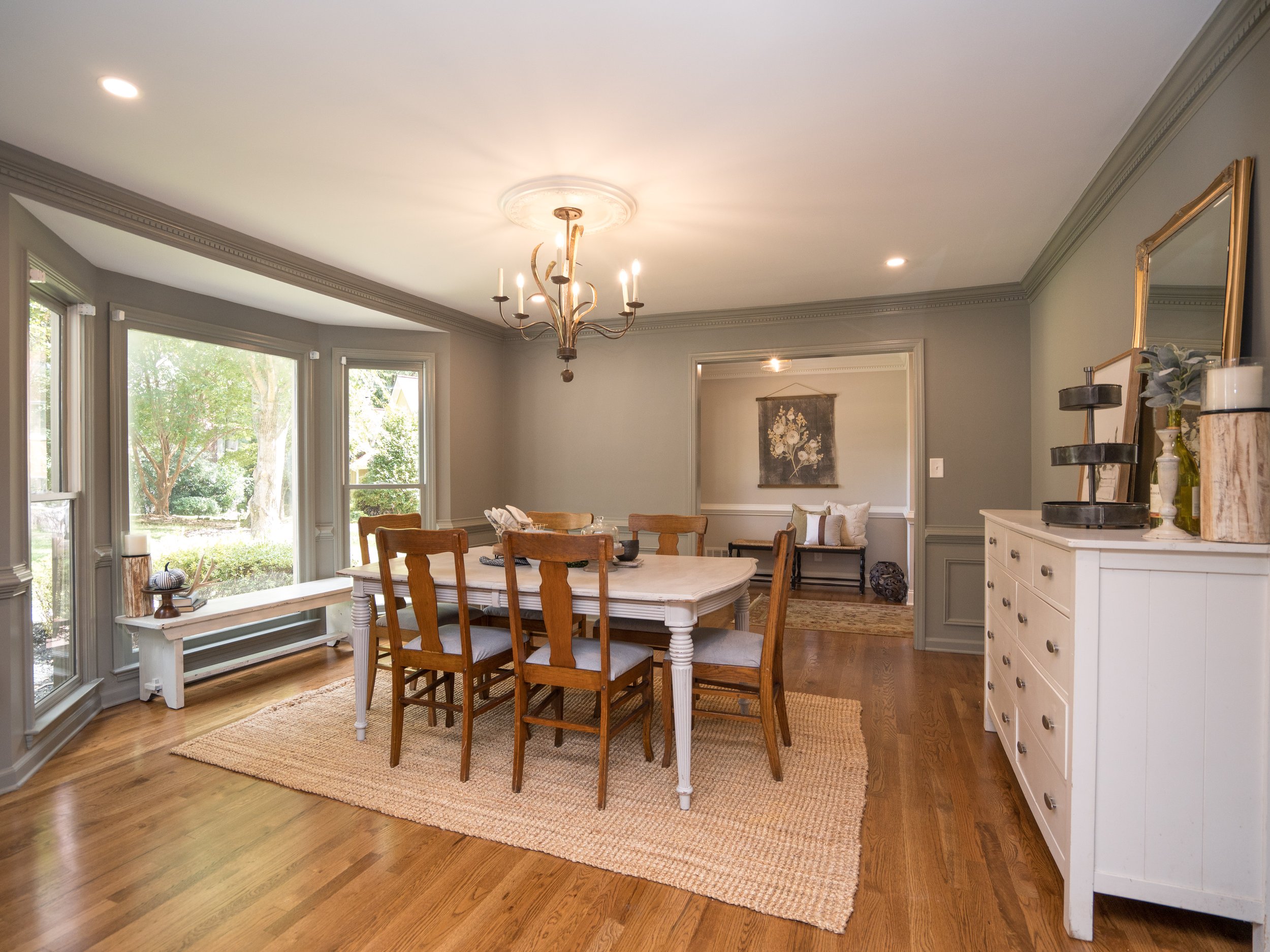
Dining B + A

Dining B +A (2)

Kitchen B +A (2)

Staircase B +A

Dining B +A (3)

Master Bathroom Vanities

Master Bathroom


Master Bedroom

Kitchen

Dining Room


